Morning,
Here are some first steps that I want to share with you from my experience with regressions.
I am new and I took it to step by step, so don’t expect anything new or either very complex.
First thing, first, we started working on some prediction “algorithms” that should work with data available in the operations domain.
We needed to have them stored in a centralized location, and it happens that they are sent to ELK. So, the first step is to query then from that location.
To do that, there is a python client library with a lot of options that I am still beginning to explore. Cutting to the point, to have a regression you need a correlation parameter between the dependent and independent variable, so we thought at first about links between the number of connection and memory usage of a specific service (for example Redis). And this is available with some simple lines of code in Jupyter:
from elasticsearch import Elasticsearch
import matplotlib.pyplot as plt
from pandas.io.json import json_normalize
es=Elasticsearch([{'host':'ELK_IP','port':'ELK_PORT'}])
res_redis=es.search(index="metricbeat-redis-*", body={"query": {"match": {'metricset.name': "info" }}}, size=1000)
df_redis = json_normalize(res_redis['hits']['hits'])
df_redis_filtered = df_redis[['_source.redis.info.clients.connected','_source.redis.info.memory.used.value']]
df_redis_filtered['_source.redis.info.memory.used.value'] = df_redis_filtered['_source.redis.info.memory.used.value'] / 10**6
df_redis_final = df_redis_filtered[df_redis_filtered['_source.redis.info.memory.used.value'] < 300]
df_redis_final.corr()
For a little bit of explaining, the used memory needs to be divided to ten to the sixth power in order to transform from bytes to MBytes, and also I wanted to exclude values of memory over 300MB. All good, unfortunately, if you plot the correlation “matrix” between these params, this happens:
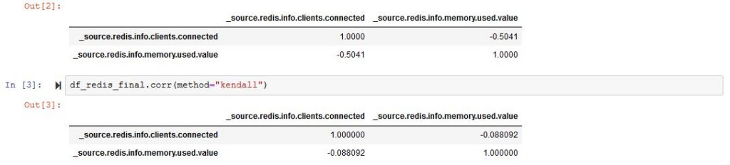
As far as we all should know, a correlation parameter should be as close as possible to 1 or -1, but it’s just not the case.
And if you want to start plotting, it will look something like:
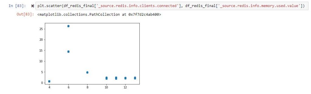
So, back to the drawing board, and we now know that we have no clue which columns are correlated. Let us not filter the columns and just remove those that are non-numeric or completely filled with zeros.
I used this to manipulate the data as simple as possible:
df_redis_numeric = df_redis.select_dtypes(['number'])
df_redis_cleaned = df_redis_numeric.loc[:, '_source.redis.info.clients.connected': '_source.redis.info.stats.net.output.bytes' ]
df_redis_final = df_redis_cleaned.loc[:, (df_redis_cleaned != 0).any(axis=0)]
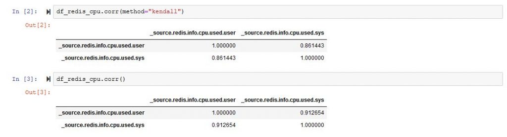
df_redis_final.corr()And it will bring you a very large matrix with a lot of rows and columns. From that matrix, you can choose two data types that are more strongly correlated. In my example [‘_source.redis.info.cpu.used.user’,’_source.redis.info.cpu.used.sys’]
If we plot the correlation matrix just for those two colums we are much better than at the start.
So we are better than before, and we can now start thinking of plotting a regression, and here is the code for that.
import matplotlib.pyplot as plt
import numpy as np
from sklearn import datasets, linear_model
import pandas as pd
x = df_redis_cpu['_source.redis.info.cpu.used.user']
y = df_redis_cpu['_source.redis.info.cpu.used.sys']
x = x.values.reshape(-1, 1)
y = y.values.reshape(-1, 1)
x_train = x[:-250]
x_test = x[-250:]
y_train = y[:-250]
y_test = y[-250:]
# Create linear regression object
regr = linear_model.LinearRegression()
# Train the model using the training sets
regr.fit(x_train, y_train)
# Plot outputs
plt.plot(x_test, regr.predict(x_test), color='red',linewidth=3)
plt.scatter(x_test, y_test, color='black')
plt.title('Test Data')
plt.xlabel('User')
plt.ylabel('Sys')
plt.xticks(())
plt.yticks(())
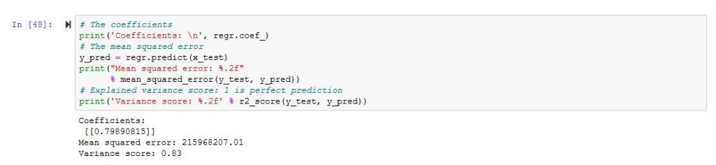
plt.show()Our DataFrame contains 1000 records from which I used 750 to “train” and another 250 to “test”. The output looked this way
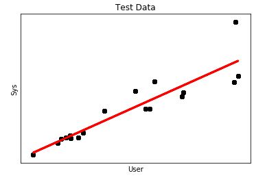
It looks more like a regression, however, what concerns me is the mean square error which is a little bit high.
So we will need to works further on the DataFrame 🙂
In order for the linear model to be applied with scikit, the input and output data are transformed into single dimension vectors. If you want to switch back and for example to create a DataFrame from the output of the regression and the actual samples from ELK, it can be done this way:
data = np.append(np.array(y_test), np.array(y_pred), axis = 1)
dataset = pd.DataFrame({'test': data[:, 0], 'pred': data[:, 1]})
dataset['pred'] = dataset['pred'].map(lambda x: '%.2f' % x)
That is all.
Cheers!