It’s true that I switched a little bit from this blog to Medium in hope of a larger audience but I will leave the link also here:
https://medium.com/@sorin.tudor/powerlifting-play-ground-582c7e4da17d
Hopefully even more analysis will come.
Cheers!
It’s true that I switched a little bit from this blog to Medium in hope of a larger audience but I will leave the link also here:
https://medium.com/@sorin.tudor/powerlifting-play-ground-582c7e4da17d
Hopefully even more analysis will come.
Cheers!
Today, I began experimenting with a Kaggle dataframe for the first time. Here is the link to it: https://www.kaggle.com/datasets/open-powerlifting/powerlifting-database
To make a long story short, if you want to plot the count for each individual column and capture the unique values of a particular column inside that dataframe, you can simply achieve it by using the following command:
mycategory = powerlifting[powerlifting['Best3DeadliftKg'] == 140.0]
mycategory.dropna(subset=['Country'], inplace=True)
This allows you to filter the records that you are interested in, as well as remove the columns that have the value NAN.
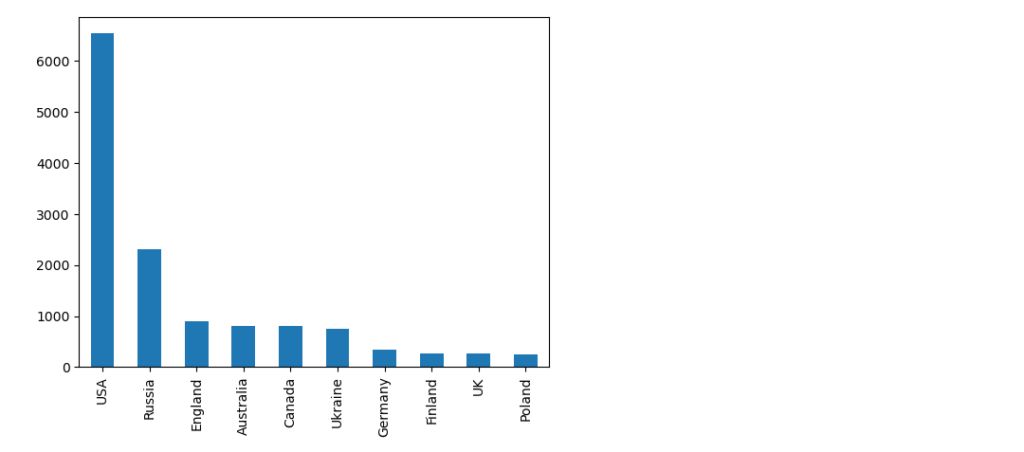
The last step involves the counting of the values for the country column and also creating a barplot:
country_series =mycategory['Country'].value_counts()
country_series.head(10).plot(kind='bar')
We will select the first 10 countries in the series since the actual number of unique countries in the dataset is actually 118.
And the plot looks like this.
I wanted to document it because it’s an operation that I have done before, and the actual feedback from the chatbot when asked what is the solution was quite a bit more complex.
First of all it consisted of the code to filter the values and save the definition of the bar plot to a JSON file, using vega-altair library (subject for exploration at one moment in time – https://altair-viz.github.io/) and parsing the data to create the plot.
The first part worked without any issues, with the following piece of code:
import altair as alt
import pandas as pd

# Assuming df is your DataFrame (from the previous example)

# 1. Filter to column 'Country' and calculate unique value counts
value_counts = mycategory['Country'].value_counts()

# 2. Convert to DataFrame for plotting
value_counts_df = pd.DataFrame({'Value': value_counts.index, 'Count': value_counts.values})

# 3. Create bar plot
chart = alt.Chart(value_counts_df).mark_bar().encode(
    x=alt.X('Value:N', axis=alt.Axis(title='Value')),
    y=alt.Y('Count:Q', axis=alt.Axis(title='Count')),
    tooltip=['Value', 'Count']
).properties(
    title='Value Counts for Column Country'
)

# Save the chart
chart.save('value_counts_column_a_bar_chart.json')
But the second part was a little bit tricky since the chatbot didn’t have a read idea of how the structure of the file was formed, suggesting:
import plotly.graph_objects as go
import json

# Load JSON data
with open('value_counts_column_a_bar_chart.json', 'r') as f:
    chart_data = json.load(f)

# Extract data for plotting correctly, handling both nominal and quantitative data
if 'Column Name' in chart_data['datasets'][0]['data'][0]:
    # Nominal data (e.g., categories like 'A', 'B', 'C')
    x = [d['Column Name'] for d in chart_data['datasets'][0]['data']]
    y = [d['Unique Value Count'] for d in chart_data['datasets'][0]['data']]
else:
    # Quantitative data (e.g., numeric values)
    x = [d['Value'] for d in chart_data['datasets'][0]['data']]
    y = [d['Count'] for d in chart_data['datasets'][0]['data']]

# Create Plotly bar chart
fig = go.Figure([go.Bar(x=x, y=y)])

# Customize layout (optional)
fig.update_layout(
    title='Value Counts for Column A',
    xaxis_title='Value',
    yaxis_title='Count'
)

# Show the chart
fig.show()
If you try to compile that it will return a KeyError:0 which is cause by the index of the chart_data[datasets][0] which is not correct.
Taking a look in the actual JSON structure you quickly find that the right key is data-85d48ef46f547bd16ab0f88b32c209fb, which bring us to the correct version:
import plotly.graph_objects as go
import json

# Load JSON data
with open('value_counts_column_a_bar_chart.json', 'r') as f:
    chart_data = json.load(f)

# Extract data for plotting correctly, handling both nominal and quantitative data
if 'Column Name' in chart_data['datasets']['data-85d48ef46f547bd16ab0f88b32c209fb']:
    # Nominal data (e.g., categories like 'A', 'B', 'C')
    x = [d['Column Name'] for d in chart_data['datasets']['data-85d48ef46f547bd16ab0f88b32c209fb']]
    y = [d['Unique Value Count'] for d in chart_data['datasets']['data-85d48ef46f547bd16ab0f88b32c209fb']]
else:
    # Quantitative data (e.g., numeric values)
    x = [d['Value'] for d in chart_data['datasets']['data-85d48ef46f547bd16ab0f88b32c209fb']]
    y = [d['Count'] for d in chart_data['datasets']['data-85d48ef46f547bd16ab0f88b32c209fb']]

# Create Plotly bar chart
fig = go.Figure([go.Bar(x=x, y=y)])

# Customize layout (optional)
fig.update_layout(
    title='Value Counts for Country',
    xaxis_title='Value',
    yaxis_title='Count'
)

# Show the chart
fig.show()
Or even a more elegant one suggested by the LLM:
mport plotly.graph_objects as go
import json

# Load JSON data
with open('value_counts_column_a_bar_chart.json', 'r') as f:
    chart_data = json.load(f)

# Find the correct data key within 'datasets'
data_key = list(chart_data['datasets'].keys())[0]

# Extract data for plotting correctly, handling both nominal and quantitative data
if 'Column Name' in chart_data['datasets'][data_key][0]:
    # Nominal data (e.g., categories like 'A', 'B', 'C')
    x = [d['Column Name'] for d in chart_data['datasets'][data_key][:10]]
    y = [d['Unique Value Count'] for d in chart_data['datasets'][data_key][:10]]
else:
    # Quantitative data (e.g., numeric values)
    x = [d['Value'] for d in chart_data['datasets'][data_key][:10]]
    y = [d['Count'] for d in chart_data['datasets'][data_key][:10]]

# Create Plotly bar chart
fig = go.Figure([go.Bar(x=x, y=y)])

# Customize layout (optional)
fig.update_layout(
    title='Value Counts for Country',
    xaxis_title='Value',
    yaxis_title='Count'
)

# Show the chart
fig.show()
Somewhere in the code is also a trim of the first 10 values in order to have similar outcomes. But the final plot looks like it should.

And that my friends is a small “pill” of working with Data Analysis, assisted by a LLM.
Cheers
I wanted for Gemini to take a look on the code that I posted here
Here is his answer:
Absolutely! Here’s a breakdown of improvements and considerations for refining the provided web scraping code:
Enhancements:
- Robust Error Handling: Incorporate
try-exceptblocks around the scraping logic and network calls. This will prevent the script from crashing due to unexpected issues like elements not being found or the website being temporarily down.- Optimized Waits: Replace the fixed
time.sleep(2)with more preciseWebDriverWaitconditions. For instance, wait for specific elements that indicate successful loading. This improves efficiency.- Reusable Function: Convert the
alcopascrapfunction to accept additional parameters (like wait times) for greater flexibility in various scraping scenarios.- Data Cleaning: Within the loop, sanitize the extracted data, removing unnecessary whitespace or non-standard characters to ensure data consistency.
- Comments: Add clear comments to explain the purpose of different code sections, which is crucial for understanding and maintenance.
Optimization Considerations
- Scrolling Logic: Investigate if the website uses infinite scroll or lazy loading. If it does, adjust the scrolling logic to trigger loading of new content only when necessary.
- Parallelism (Advanced): Consider parallelizing requests for different brands using threading or multiprocessing, especially if the scraping scope is large.
from bs4 import BeautifulSoup
from selenium import webdriver
from selenium.webdriver.common.by import By
from selenium.webdriver.support.ui import WebDriverWait
from selenium.webdriver.support import expected_conditions as EC
from selenium.common.exceptions import TimeoutException, NoSuchElementException
import time

def alcopascrap(brand, max_wait_time=10):
    driver = webdriver.Chrome()

    try:
        driver.get(f"https://www.alcopa-auction.fr/ro/cautare?brand={brand}")
        WebDriverWait(driver, max_wait_time).until(
            EC.element_to_be_clickable((By.ID, "CybotCookiebotDialogBodyButtonAccept"))
        ).click()

        # Optimized scrolling (Implementation depends on the site's scrolling mechanism)

        list_of_cars = []

        ratings = soup.find_all('div',{'data-brand':brand})
        for rating in ratings:
            data = {}
            try:
                data['title'] = rating.find('li',{'class':'mb-2 list-group-item border-0 p-0'}).get_text().strip()
                data['price'] = rating['data-prices']
                data['details'] = [element.get_text().strip() for element in rating.find_all('li', {'class':'list-group-item border-0 p-0'})]
                data['link'] = rating.find('a', {'class':'no-decoration'}).get('href')
                list_of_cars.append(data)
            except NoSuchElementException:
                print(f"Error processing car data in rating block: {rating}")

        # ... (rest of your code)

    except TimeoutException:
        print(f"Timeout waiting for elements on page for brand: {brand}")
    finally:
        driver.quit()

alcopascrap('nissan')
It lacks a couple of lines like:
        html_source = driver.page_source
        soup = BeautifulSoup(html_source, 'html.parser')
And
  for car in list_of_cars:
            print(car, end='\n')
But otherwise it works like charm and it’s faster than my first implementation
Use chatbots, they know better most of the times.
Cheers!
Just for reference a small example of scrapping https://www.alcopa-auction.fr/ for new cars on specific brand.
It can be improved a lot but just as a reference of the code.
from bs4 import BeautifulSoup
from selenium.webdriver.common.by import By
from selenium.webdriver.support.ui import WebDriverWait
from selenium.webdriver.support import expected_conditions as EC
from selenium import webdriver
import time

# Set up a headless browser
driver = webdriver.Chrome()


# Load the website with JavaScript
def alcopascrap(brand):

    driver.get(f"https://www.alcopa-auction.fr/ro/cautare?brand={brand}")

    # Wait for JavaScript to execute (adjust wait time if needed)
    driver.implicitly_wait(180)


    WebDriverWait(driver, 1).until(
    EC.element_to_be_clickable((By.ID, "CybotCookiebotDialogBodyButtonAccept"))
).click()

# Get initial scroll height
    last_height = driver.execute_script("return document.body.scrollHeight")

    while True:
    # Scroll down
        driver.execute_script("window.scrollTo(0, document.body.scrollHeight);")

    # Wait for loading
        time.sleep(2)  # Adjust wait time as needed

    # Calculate new scroll height and compare with previous
        new_height = driver.execute_script("return document.body.scrollHeight")
        if new_height == last_height:
            break
        last_height = new_height

# Get the HTML source with JavaScript modifications
    html_source = driver.page_source


# Parse the HTML with BeautifulSoup
    soup = BeautifulSoup(html_source, 'html.parser')

#Create a list to store the data

    list_of_cars = []
# Now you can use BeautifulSoup to extract the data you need
# ...
    ratings = soup.find_all('div',{'data-brand':brand})
    for rating in ratings:
        data = {}
        data['title'] = rating.find('li',{'class':'mb-2 list-group-item border-0 p-0'}).get_text()
        data['price'] = rating['data-prices']
        data['details'] = [ element.get_text().strip() for element in rating.find_all('li',{'class':'list-group-item border-0 p-0'})]
        data['link'] = rating.find('a', {'class':'no-decoration'}).get('href')
        list_of_cars.append(data)

# Print the data
    for car in list_of_cars:
        print(car, end='\n')

# Close browser

    driver.quit()


alcopascrap('nissan')
As for the code description, here is the one from Github Copilot, you judge if it’s good or not.
This Python script uses Selenium and BeautifulSoup to scrape car data from the Alcopa Auction website. Here’s a step-by-step breakdown:
- Import necessary libraries: BeautifulSoup for parsing HTML, Selenium for browser automation, and time for controlling the script’s timing.
- Set up a headless browser using Selenium’s webdriver. This script uses Chrome as the browser.
- Define a function
alcopascrap(brand), which takes a car brand as an argument and scrapes data for that brand from the website.- The function first navigates to the Alcopa Auction website’s search page for the specified brand.
- It waits for the page to load, then clicks the accept button on the cookie consent dialog.
- It then enters a loop where it continually scrolls to the bottom of the page, waits for more content to load, and repeats until no more new content is loaded. This is done to ensure all the dynamic content loaded by JavaScript is captured.
- After all content is loaded, it gets the page’s HTML source.
- It then parses the HTML using BeautifulSoup.
- It creates an empty list
list_of_carsto store the car data.- It finds all
divelements with adata-brandattribute matching the specified brand. For each of these elements, it extracts the car title, price, details, and link, and stores them in a dictionary. Each dictionary is then appended tolist_of_cars.- It prints out the data for each car.
- Finally, it closes the browser.
- The function is then called with ‘nissan’ as the argument, so it scrapes data for Nissan cars.
This script is a good example of how to use Selenium and BeautifulSoup together to scrape data from a website that uses JavaScript to load content.
Hi,
I just started a recap of calculus and wanted to know how and if it’s hard to plot functions in a programming language.
Searching this topic I found this article, which gives an elegant approach:
https://scriptverse.academy/tutorials/python-matplotlib-plot-function.html
After trying the code here is the result
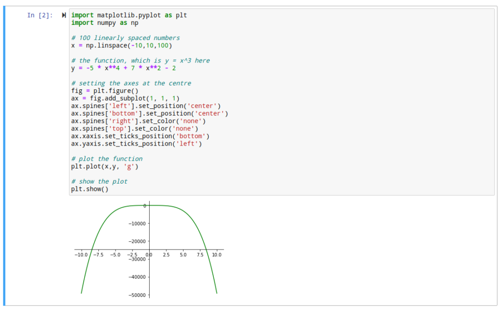
Surely there are even more complex cases but at least there is a start for adapting the code.
Cheers
Hi,
Just a very small update. I saw that when you run the CMD under Administrator rights under Windows, the Jupyter working directory is automatically set to C:\Windows\System32…..which is not great at all.
I tried the standard method which is listed here but it does not work. Even after I save the file, it doesn’t take it into consideration and it will overwrite it at another export.
Just start a normal command prompt and run jupyter lab and it will take you as a working dir to your local user dir.
Cheers
Hi,
We are trying to implement a decision tree algorithm in order to see if our resource usage can classify our servers in different categories.
First step in that process is querying Prometheus from Python and create some data frames with some basic information in order to get them aggregated.
To that purpose, you can also use the following lines of code:
import requests
import copy

URL = "http://[node_hostname]:9090/api/v1/query?query=metric_to_be_quried[1d]"

r = requests.get(url = URL)

data = r.json()

data_dict={}
metric_list = []
for i in data['data']['result']:
    data_dict = copy.deepcopy(i['metric'])
    for j in i['values']:
        data_dict['time'] = j[0]
        data_dict['value'] = j[1]
        metric_list.append(data_dict)

df_metric = pd.DataFrame(metric_list)
Other pieces will follow.
Cheers
There is a learning program in our company focused on gaining knowledge for “AI era”
To that purpose we played a little bit with some performance data and came to some conclusions.
I invite you to take a look
Hello,
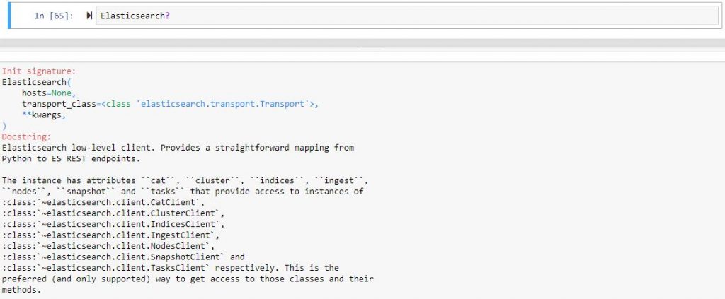
I want to share with you a simple trick that I saw in a training course related to objects and classes functionality in IPython.
If you want to see a short description of the object or class you are using in your notebook please use , for example, if you just imported Elasticsearch from the elasticsearch module, the following
And if you want more details, you can use it like this, it will actually show you the code 🙂
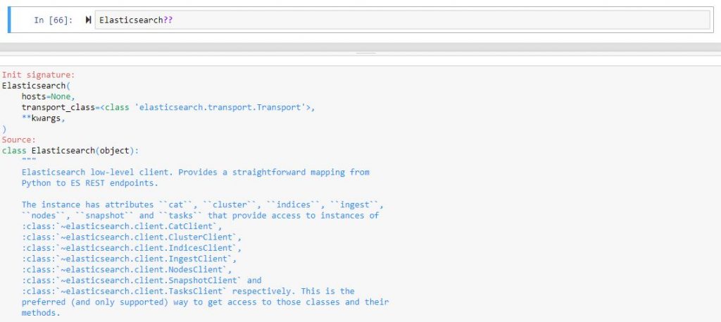
I tried to do that also with DataFrame but it seems that it works only on already created objects
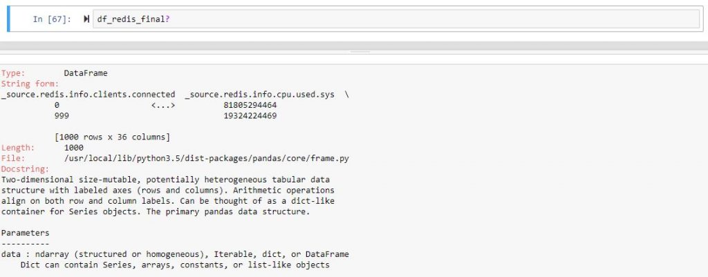
And for the more detailed look, you can try it yourself.
Here is also a link to more experienced people https://jakevdp.github.io/PythonDataScienceHandbook/01.01-help-and-documentation.html
Cheers!
Morning,
Here are some first steps that I want to share with you from my experience with regressions.
I am new and I took it to step by step, so don’t expect anything new or either very complex.
First thing, first, we started working on some prediction “algorithms” that should work with data available in the operations domain.
We needed to have them stored in a centralized location, and it happens that they are sent to ELK. So, the first step is to query then from that location.
To do that, there is a python client library with a lot of options that I am still beginning to explore. Cutting to the point, to have a regression you need a correlation parameter between the dependent and independent variable, so we thought at first about links between the number of connection and memory usage of a specific service (for example Redis). And this is available with some simple lines of code in Jupyter:
from elasticsearch import Elasticsearch
import matplotlib.pyplot as plt
from pandas.io.json import json_normalize
es=Elasticsearch([{'host':'ELK_IP','port':'ELK_PORT'}])
res_redis=es.search(index="metricbeat-redis-*", body={"query": {"match": {'metricset.name': "info" }}}, size=1000)
df_redis = json_normalize(res_redis['hits']['hits'])
df_redis_filtered = df_redis[['_source.redis.info.clients.connected','_source.redis.info.memory.used.value']]
df_redis_filtered['_source.redis.info.memory.used.value'] = df_redis_filtered['_source.redis.info.memory.used.value'] / 10**6
df_redis_final = df_redis_filtered[df_redis_filtered['_source.redis.info.memory.used.value'] < 300]
df_redis_final.corr()
For a little bit of explaining, the used memory needs to be divided to ten to the sixth power in order to transform from bytes to MBytes, and also I wanted to exclude values of memory over 300MB. All good, unfortunately, if you plot the correlation “matrix” between these params, this happens:

As far as we all should know, a correlation parameter should be as close as possible to 1 or -1, but it’s just not the case.
And if you want to start plotting, it will look something like:

So, back to the drawing board, and we now know that we have no clue which columns are correlated. Let us not filter the columns and just remove those that are non-numeric or completely filled with zeros.
I used this to manipulate the data as simple as possible:
df_redis_numeric = df_redis.select_dtypes(['number'])
df_redis_cleaned = df_redis_numeric.loc[:, '_source.redis.info.clients.connected': '_source.redis.info.stats.net.output.bytes' ]
df_redis_final = df_redis_cleaned.loc[:, (df_redis_cleaned != 0).any(axis=0)]
df_redis_final.corr()
And it will bring you a very large matrix with a lot of rows and columns. From that matrix, you can choose two data types that are more strongly correlated. In my example [‘_source.redis.info.cpu.used.user’,’_source.redis.info.cpu.used.sys’]
If we plot the correlation matrix just for those two colums we are much better than at the start.

So we are better than before, and we can now start thinking of plotting a regression, and here is the code for that.
import matplotlib.pyplot as plt
import numpy as np
from sklearn import datasets, linear_model
import pandas as pd

x = df_redis_cpu['_source.redis.info.cpu.used.user']
y = df_redis_cpu['_source.redis.info.cpu.used.sys']

x = x.values.reshape(-1, 1)
y = y.values.reshape(-1, 1)

x_train = x[:-250]
x_test = x[-250:]

y_train = y[:-250]
y_test = y[-250:]

# Create linear regression object
regr = linear_model.LinearRegression()

# Train the model using the training sets
regr.fit(x_train, y_train)

# Plot outputs
plt.plot(x_test, regr.predict(x_test), color='red',linewidth=3)
plt.scatter(x_test, y_test,  color='black')
plt.title('Test Data')
plt.xlabel('User')
plt.ylabel('Sys')
plt.xticks(())
plt.yticks(())

plt.show()
Our DataFrame contains 1000 records from which I used 750 to “train” and another 250 to “test”. The output looked this way
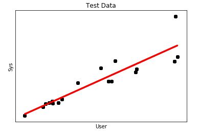
It looks more like a regression, however, what concerns me is the mean square error which is a little bit high.

So we will need to works further on the DataFrame 🙂
In order for the linear model to be applied with scikit, the input and output data are transformed into single dimension vectors. If you want to switch back and for example to create a DataFrame from the output of the regression and the actual samples from ELK, it can be done this way:
data = np.append(np.array(y_test), np.array(y_pred), axis = 1)
dataset = pd.DataFrame({'test': data[:, 0], 'pred': data[:, 1]})
dataset['pred'] = dataset['pred'].map(lambda x: '%.2f' % x)
That is all.
Cheers!