Today, I began experimenting with a Kaggle dataframe for the first time. Here is the link to it: https://www.kaggle.com/datasets/open-powerlifting/powerlifting-database
To make a long story short, if you want to plot the count for each individual column and capture the unique values of a particular column inside that dataframe, you can simply achieve it by using the following command:
mycategory = powerlifting[powerlifting['Best3DeadliftKg'] == 140.0]
mycategory.dropna(subset=['Country'], inplace=True)
This allows you to filter the records that you are interested in, as well as remove the columns that have the value NAN.
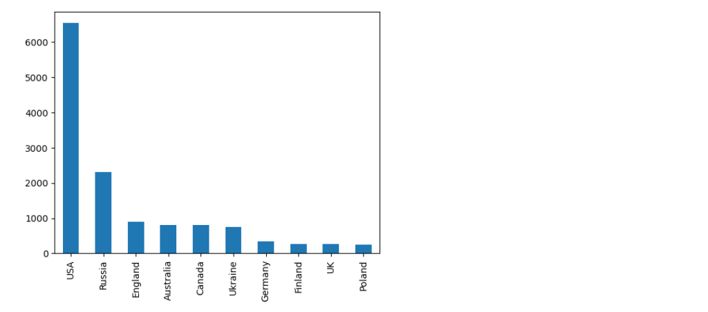
The last step involves the counting of the values for the country column and also creating a barplot:
country_series =mycategory['Country'].value_counts()
country_series.head(10).plot(kind='bar')
We will select the first 10 countries in the series since the actual number of unique countries in the dataset is actually 118.
And the plot looks like this.
I wanted to document it because it’s an operation that I have done before, and the actual feedback from the chatbot when asked what is the solution was quite a bit more complex.
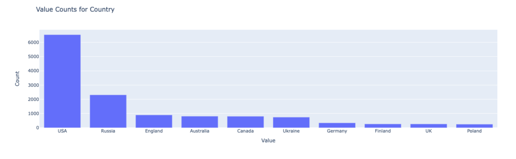
First of all it consisted of the code to filter the values and save the definition of the bar plot to a JSON file, using vega-altair library (subject for exploration at one moment in time – https://altair-viz.github.io/) and parsing the data to create the plot.
The first part worked without any issues, with the following piece of code:
import altair as alt
import pandas as pd

# Assuming df is your DataFrame (from the previous example)

# 1. Filter to column 'Country' and calculate unique value counts
value_counts = mycategory['Country'].value_counts()

# 2. Convert to DataFrame for plotting
value_counts_df = pd.DataFrame({'Value': value_counts.index, 'Count': value_counts.values})

# 3. Create bar plot
chart = alt.Chart(value_counts_df).mark_bar().encode(
    x=alt.X('Value:N', axis=alt.Axis(title='Value')),
    y=alt.Y('Count:Q', axis=alt.Axis(title='Count')),
    tooltip=['Value', 'Count']
).properties(
    title='Value Counts for Column Country'
)

# Save the chart
chart.save('value_counts_column_a_bar_chart.json')
But the second part was a little bit tricky since the chatbot didn’t have a read idea of how the structure of the file was formed, suggesting:
import plotly.graph_objects as go
import json

# Load JSON data
with open('value_counts_column_a_bar_chart.json', 'r') as f:
    chart_data = json.load(f)

# Extract data for plotting correctly, handling both nominal and quantitative data
if 'Column Name' in chart_data['datasets'][0]['data'][0]:
    # Nominal data (e.g., categories like 'A', 'B', 'C')
    x = [d['Column Name'] for d in chart_data['datasets'][0]['data']]
    y = [d['Unique Value Count'] for d in chart_data['datasets'][0]['data']]
else:
    # Quantitative data (e.g., numeric values)
    x = [d['Value'] for d in chart_data['datasets'][0]['data']]
    y = [d['Count'] for d in chart_data['datasets'][0]['data']]

# Create Plotly bar chart
fig = go.Figure([go.Bar(x=x, y=y)])

# Customize layout (optional)
fig.update_layout(
    title='Value Counts for Column A',
    xaxis_title='Value',
    yaxis_title='Count'
)

# Show the chart
fig.show()
If you try to compile that it will return a KeyError:0 which is cause by the index of the chart_data[datasets][0] which is not correct.
Taking a look in the actual JSON structure you quickly find that the right key is data-85d48ef46f547bd16ab0f88b32c209fb, which bring us to the correct version:
import plotly.graph_objects as go
import json

# Load JSON data
with open('value_counts_column_a_bar_chart.json', 'r') as f:
    chart_data = json.load(f)

# Extract data for plotting correctly, handling both nominal and quantitative data
if 'Column Name' in chart_data['datasets']['data-85d48ef46f547bd16ab0f88b32c209fb']:
    # Nominal data (e.g., categories like 'A', 'B', 'C')
    x = [d['Column Name'] for d in chart_data['datasets']['data-85d48ef46f547bd16ab0f88b32c209fb']]
    y = [d['Unique Value Count'] for d in chart_data['datasets']['data-85d48ef46f547bd16ab0f88b32c209fb']]
else:
    # Quantitative data (e.g., numeric values)
    x = [d['Value'] for d in chart_data['datasets']['data-85d48ef46f547bd16ab0f88b32c209fb']]
    y = [d['Count'] for d in chart_data['datasets']['data-85d48ef46f547bd16ab0f88b32c209fb']]

# Create Plotly bar chart
fig = go.Figure([go.Bar(x=x, y=y)])

# Customize layout (optional)
fig.update_layout(
    title='Value Counts for Country',
    xaxis_title='Value',
    yaxis_title='Count'
)

# Show the chart
fig.show()
Or even a more elegant one suggested by the LLM:
mport plotly.graph_objects as go
import json

# Load JSON data
with open('value_counts_column_a_bar_chart.json', 'r') as f:
    chart_data = json.load(f)

# Find the correct data key within 'datasets'
data_key = list(chart_data['datasets'].keys())[0]

# Extract data for plotting correctly, handling both nominal and quantitative data
if 'Column Name' in chart_data['datasets'][data_key][0]:
    # Nominal data (e.g., categories like 'A', 'B', 'C')
    x = [d['Column Name'] for d in chart_data['datasets'][data_key][:10]]
    y = [d['Unique Value Count'] for d in chart_data['datasets'][data_key][:10]]
else:
    # Quantitative data (e.g., numeric values)
    x = [d['Value'] for d in chart_data['datasets'][data_key][:10]]
    y = [d['Count'] for d in chart_data['datasets'][data_key][:10]]

# Create Plotly bar chart
fig = go.Figure([go.Bar(x=x, y=y)])

# Customize layout (optional)
fig.update_layout(
    title='Value Counts for Country',
    xaxis_title='Value',
    yaxis_title='Count'
)

# Show the chart
fig.show()
Somewhere in the code is also a trim of the first 10 values in order to have similar outcomes. But the final plot looks like it should.
And that my friends is a small “pill” of working with Data Analysis, assisted by a LLM.
Cheers